
Extra Bold Italic type foundry aims at demonstrating the theories of typeface design that move away from the core idea of typeface design, and explore contemporary typefaces through an analytical lens. The foundry will release 4 typeface proposals rooted in questioning the traditions of typeface design, and will challenge the same traditions by demonstrating unusual, unexpected letterforms. The core idea of this thesis project, thus, lies in studying the evolution of display typefaces, and their properties, through the years. The four typefaces designed through this period of development aim to create a discourse about the current ideas of display typefaces and throw light on an alternate view point for type designers that offers a well-researched explanation for the design of these fonts.
Extra Bold Italic Foundry
Shivani Parasnis

A vinyl cover set in Naranja

A promotional poster advertising the release of Ego Regular

A flexible identity design for a food magazine called Mold

A revival poster based on the aesthetics of a 18th century tavern in Pennsylvania called Dobbin House
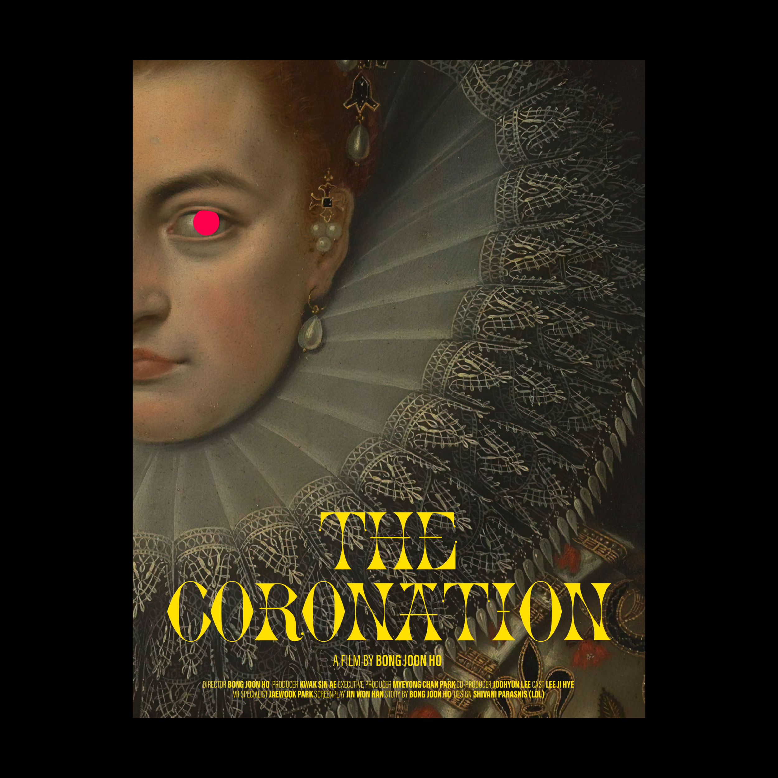
A movie poster set in Pirouette

Identity and magazine cover design for a magazine called Curious Homes

A bilingual poster set in Thesis Sans

A bilingual poster set in Thesis Sans

An overview of the 30-page risographed zine that features artworks by 10 different artists made using the typefaces of Extra Bold Italic Type Foundry

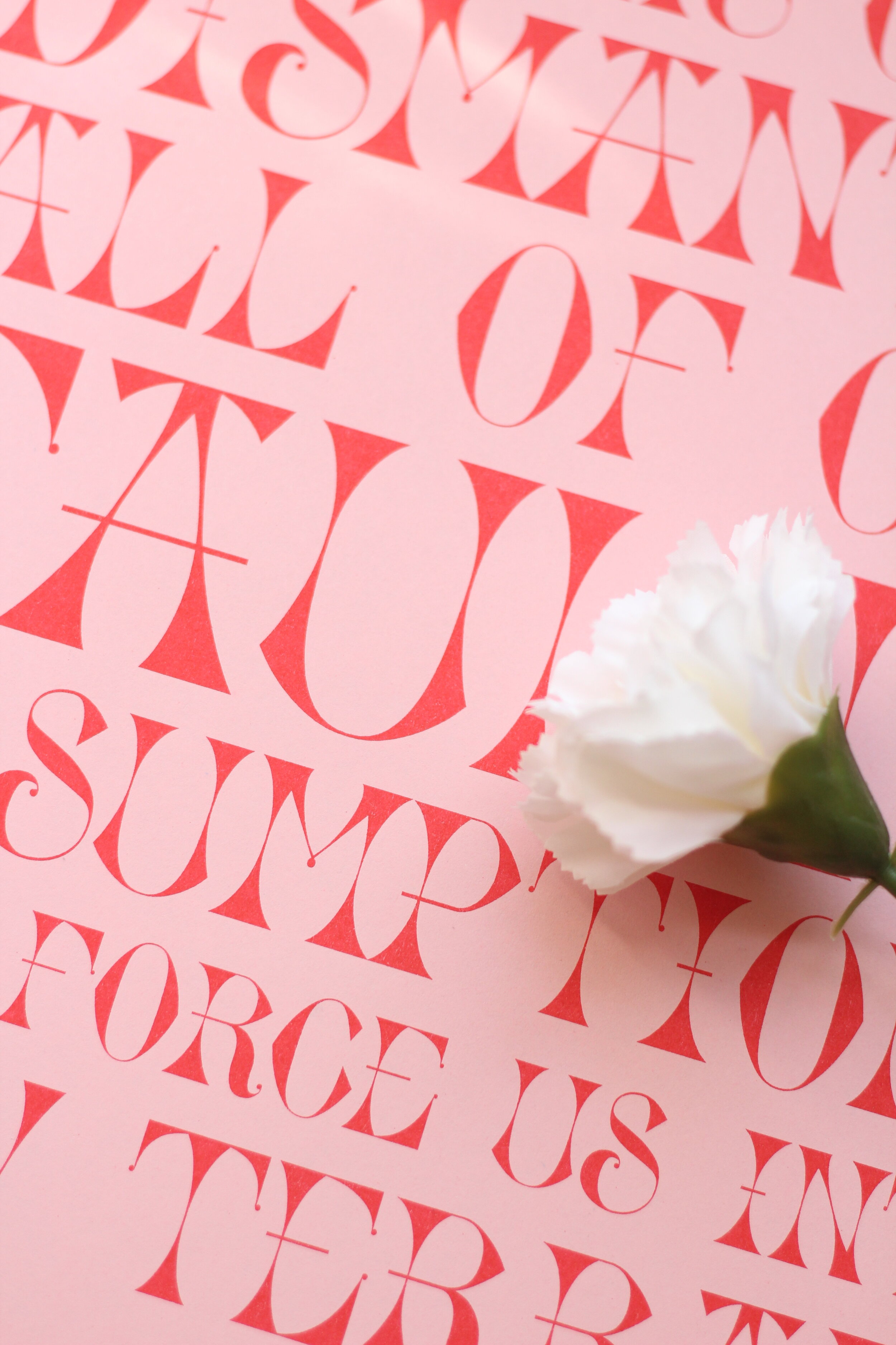
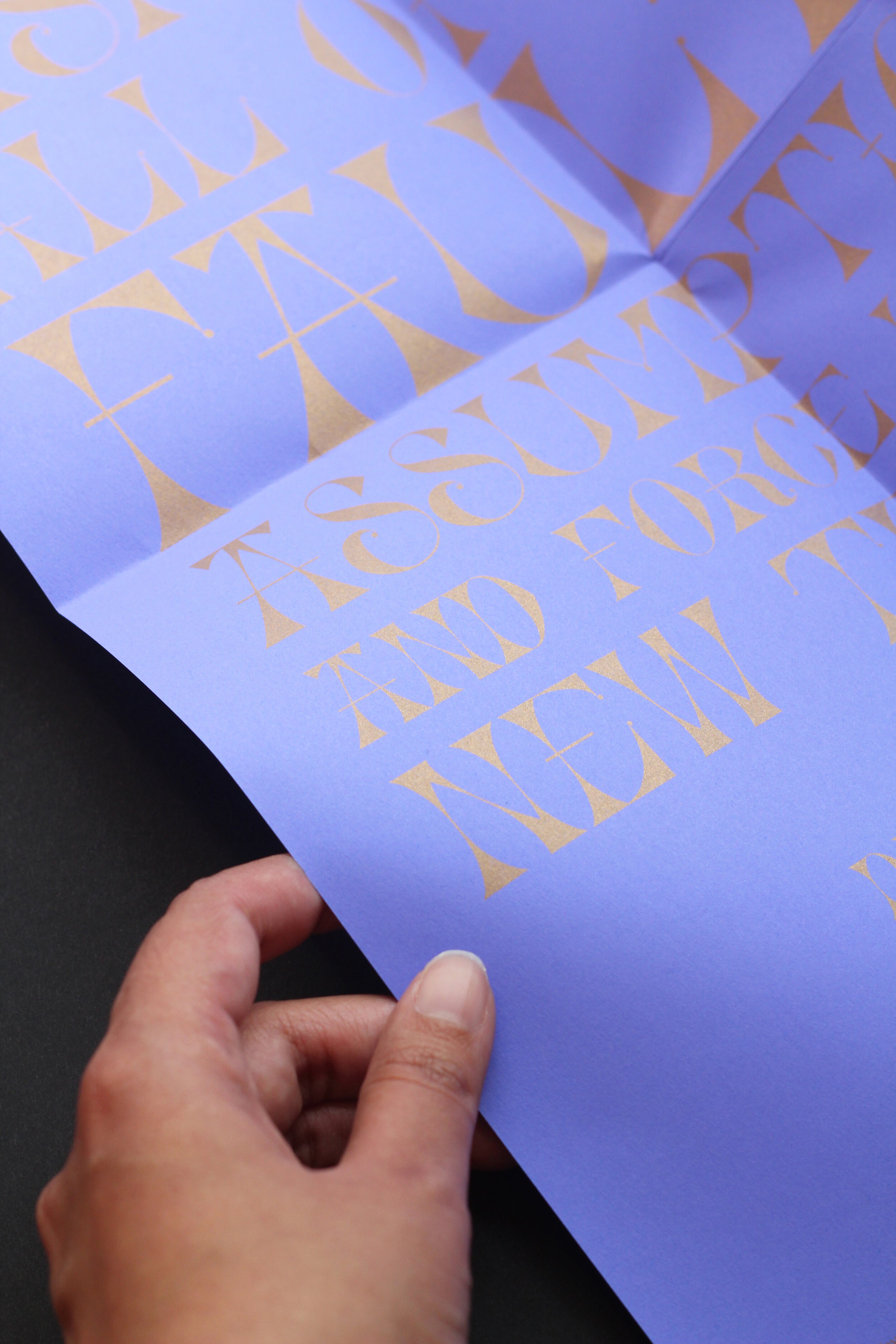
A close-up shot of the zine.


A gif showing a couple of shots of the thesis book aka the biggest type specimen

A type specimen showing the letterforms of Ego Regular

A type specimen showing the letterforms of Naranja

A type specimen showing the letterforms of Pirouette

A type specimen showing the letterforms of Mold