
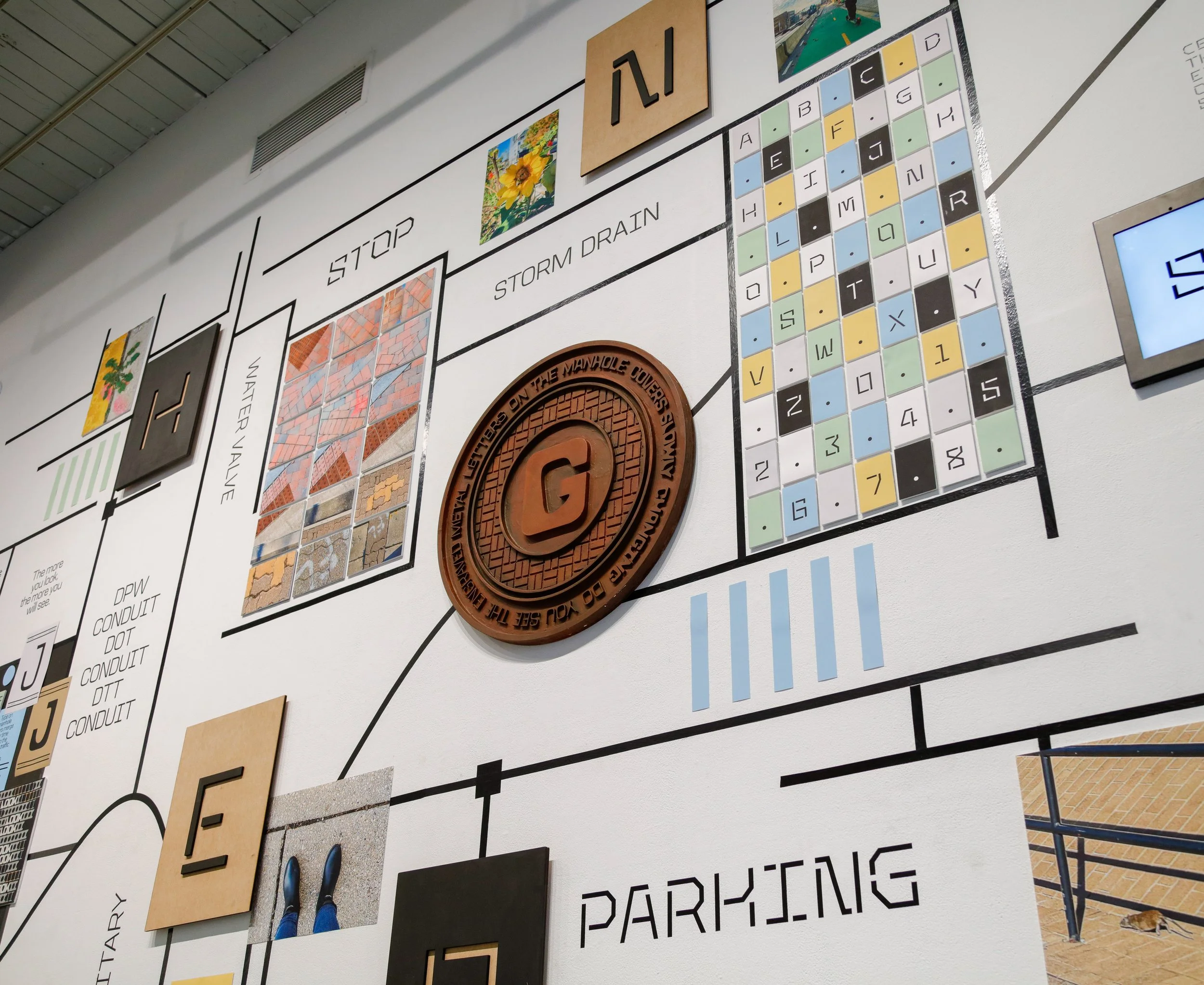
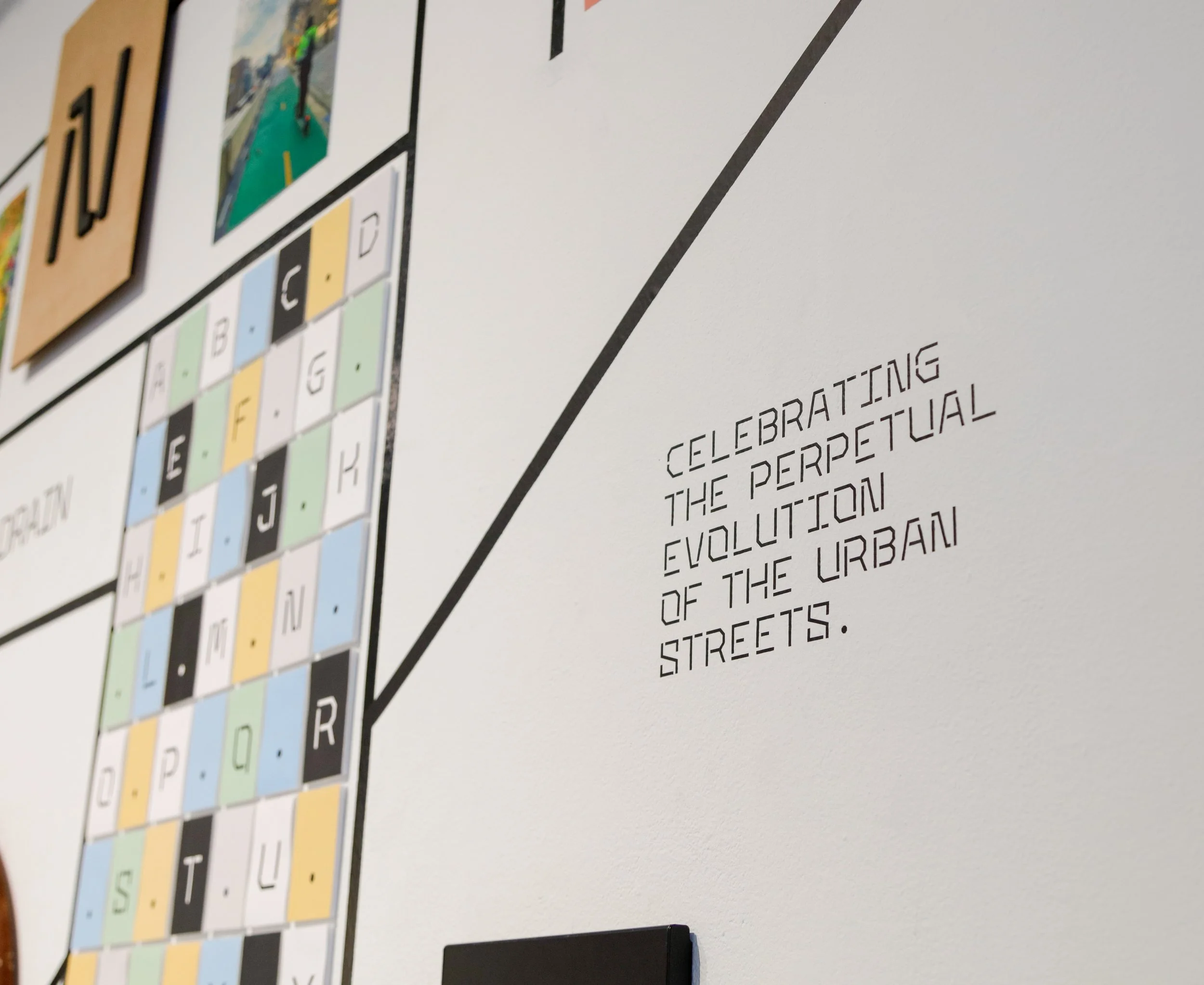
This project celebrates the perpetual evolution of urban streets, zooming into evolving textures, emerging lifeforms, and changing typography, and zooming out to a maze of roads and pathways. This perspective is exemplified in SEWER, a variable typeface inspired by the natural weathering of metal letters on manhole covers, and ROADS, symbolizing the way planned roads are altered by desired pathways, created by inhabitants for convenience. Additionally, the exhibit features photographic documentation capturing the fleeting moments of lifeforms on the streets and the interplay among sidewalk patterns.
Street View
Devyani Mahadevan
Street View: Exhibit
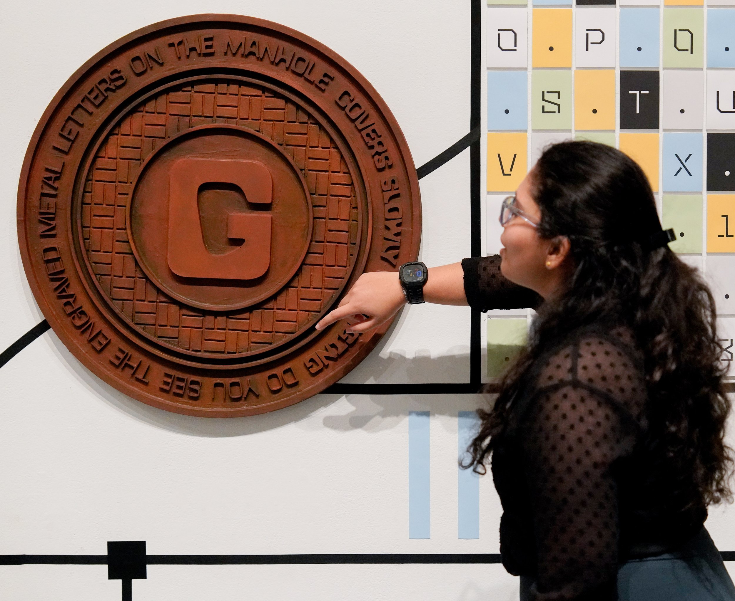
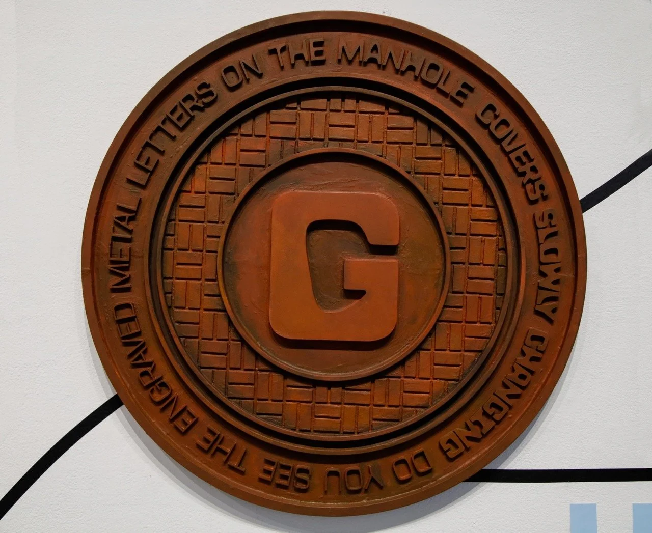
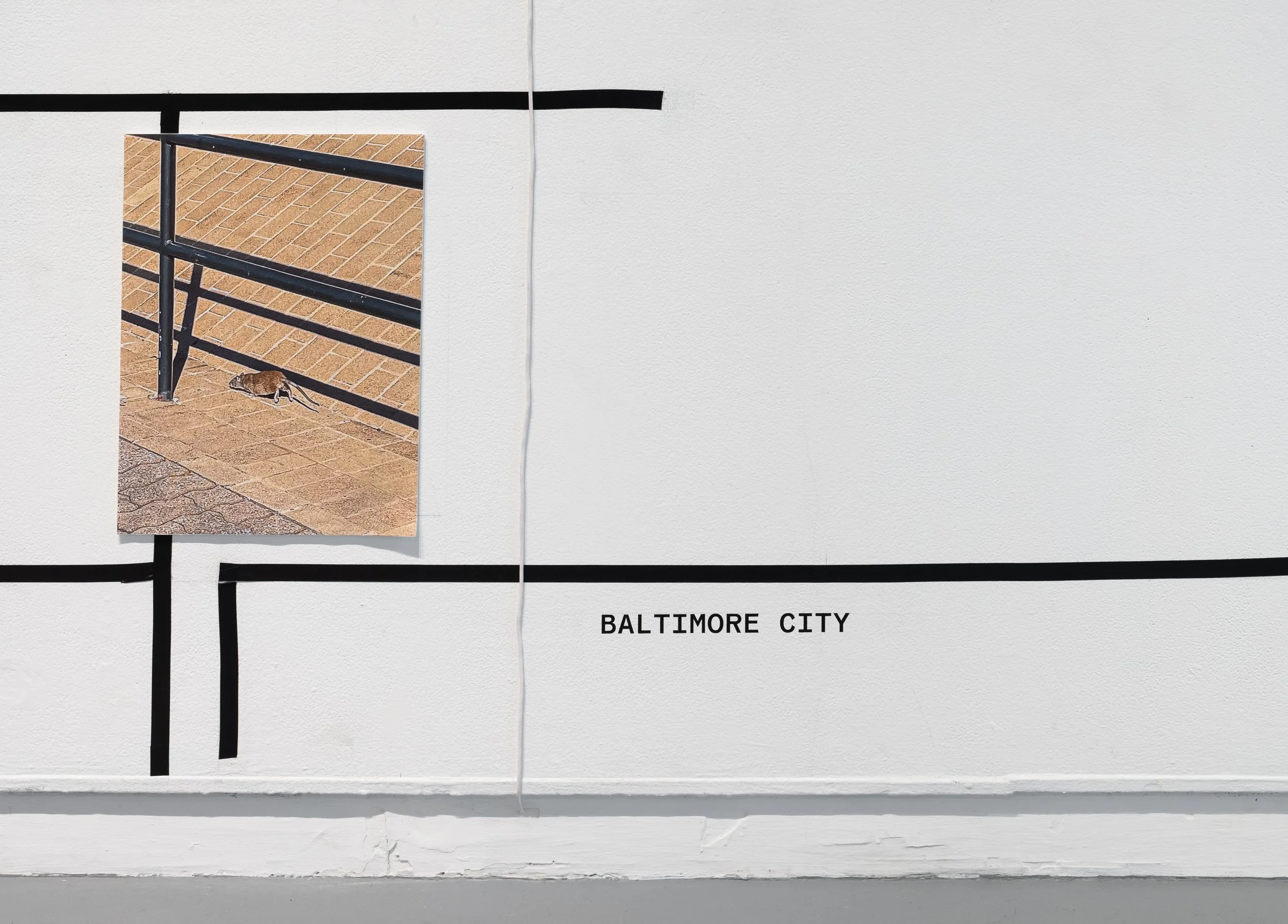
The Manhole Cover
This piece, made out of laser-cut hardboard, showcases the full range of the variable typeface: Sewer, in the statement, “do you see the engraved metal letters on the manhole covers slowly changing”.

The Manhole Cover: Close up
The uppercase G from Sewer: Flat was placed in the center of the manhole cover.
The Manhole Cover

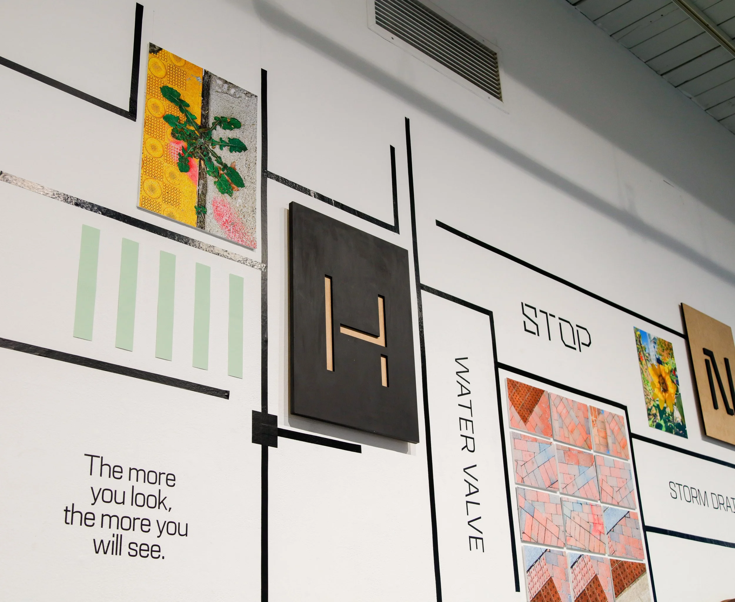
The Poster pin-up board on the wall
The type specimen posters of Sewer typeface were showcased on a black patch on the wall, recreating the effect of spotting a pin-up poster board on the streets.
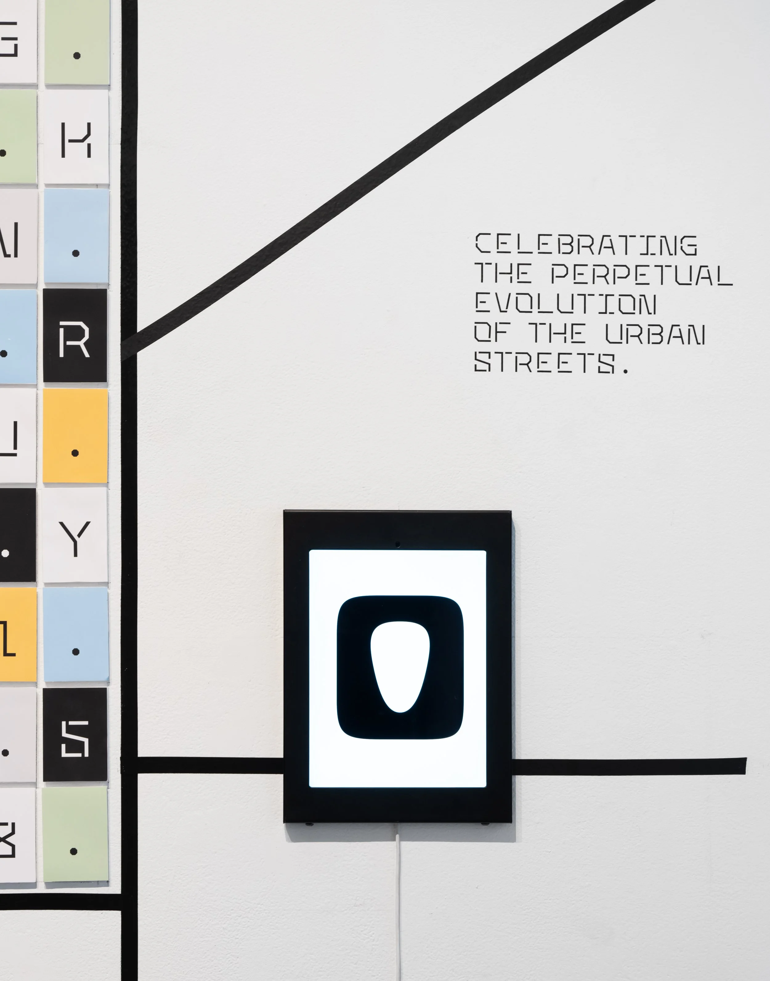
The mounted ipad showcased 3 videos:
1. A convenience path passing through the letter S in roads typeface
2. The full range of Sewer typeface: Medium to Flat with the interpolation slider
3. The simplified and digitized texture grids from the flipbook in motion
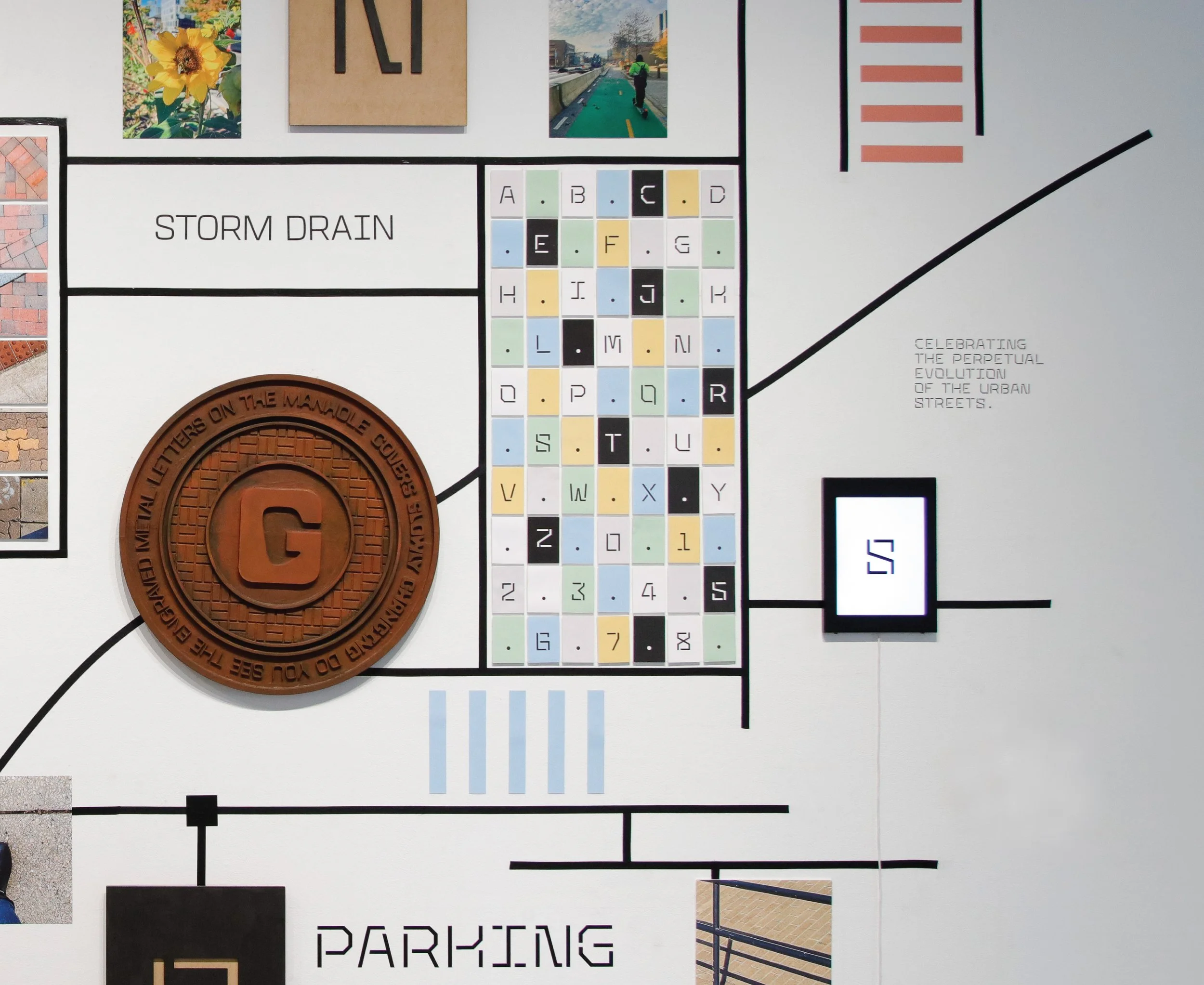
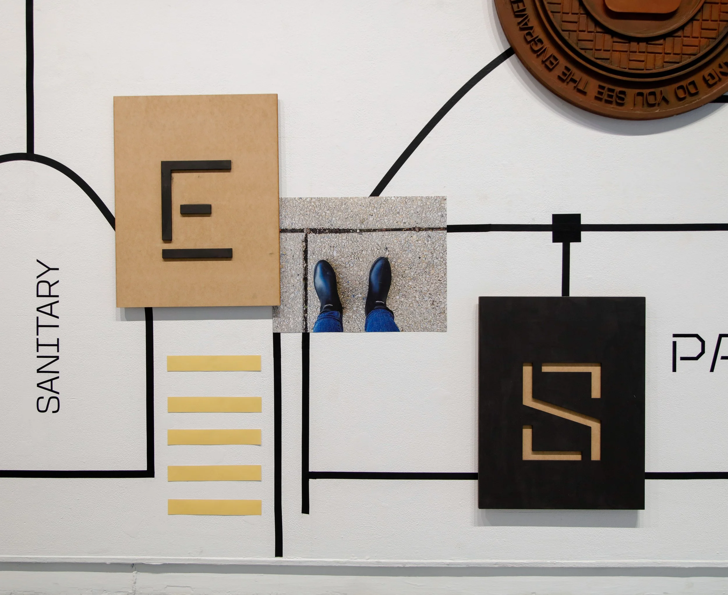
The character set of Roads Typeface
Each character of the Roads typeface was mounted and displayed with a period symbol (inspired by the stop sign on the streets) in between each of them. The color palette of Roads type specimen was inspired by printed Road maps commonly available in folded booklets to aid navigation while driving.
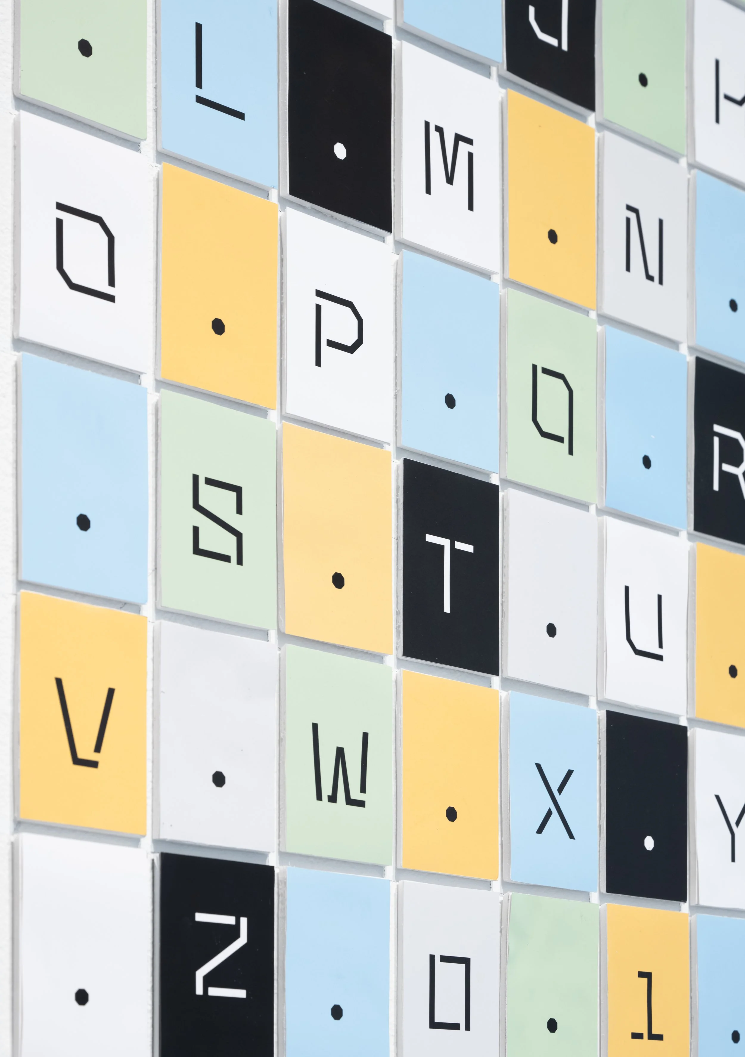
The character set of Roads Typeface: Close up
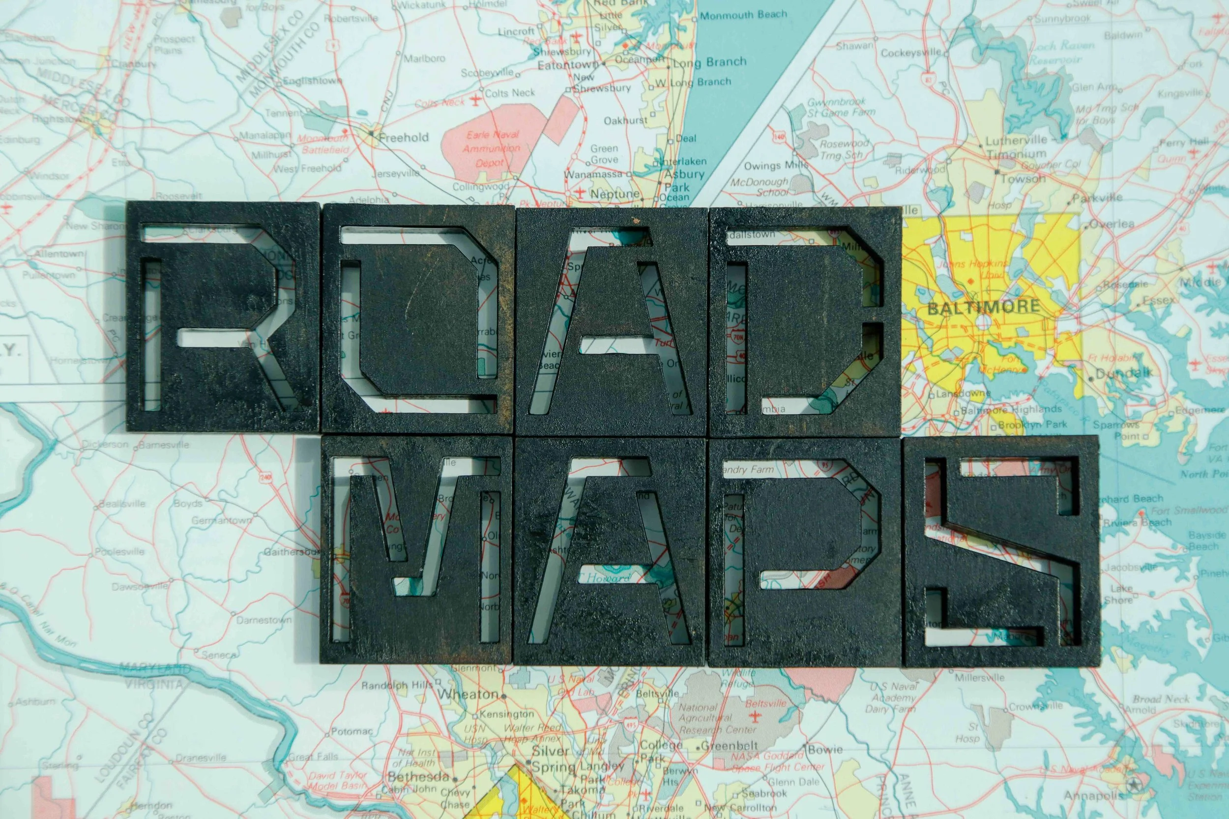
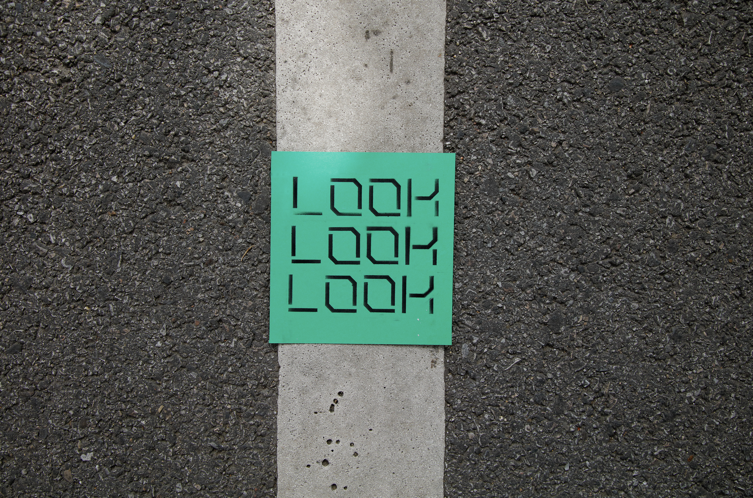
Selected letters from the Roads typeface were laser cut into big stencil pieces on hardboard to display them in a large size.
Roads Stencils
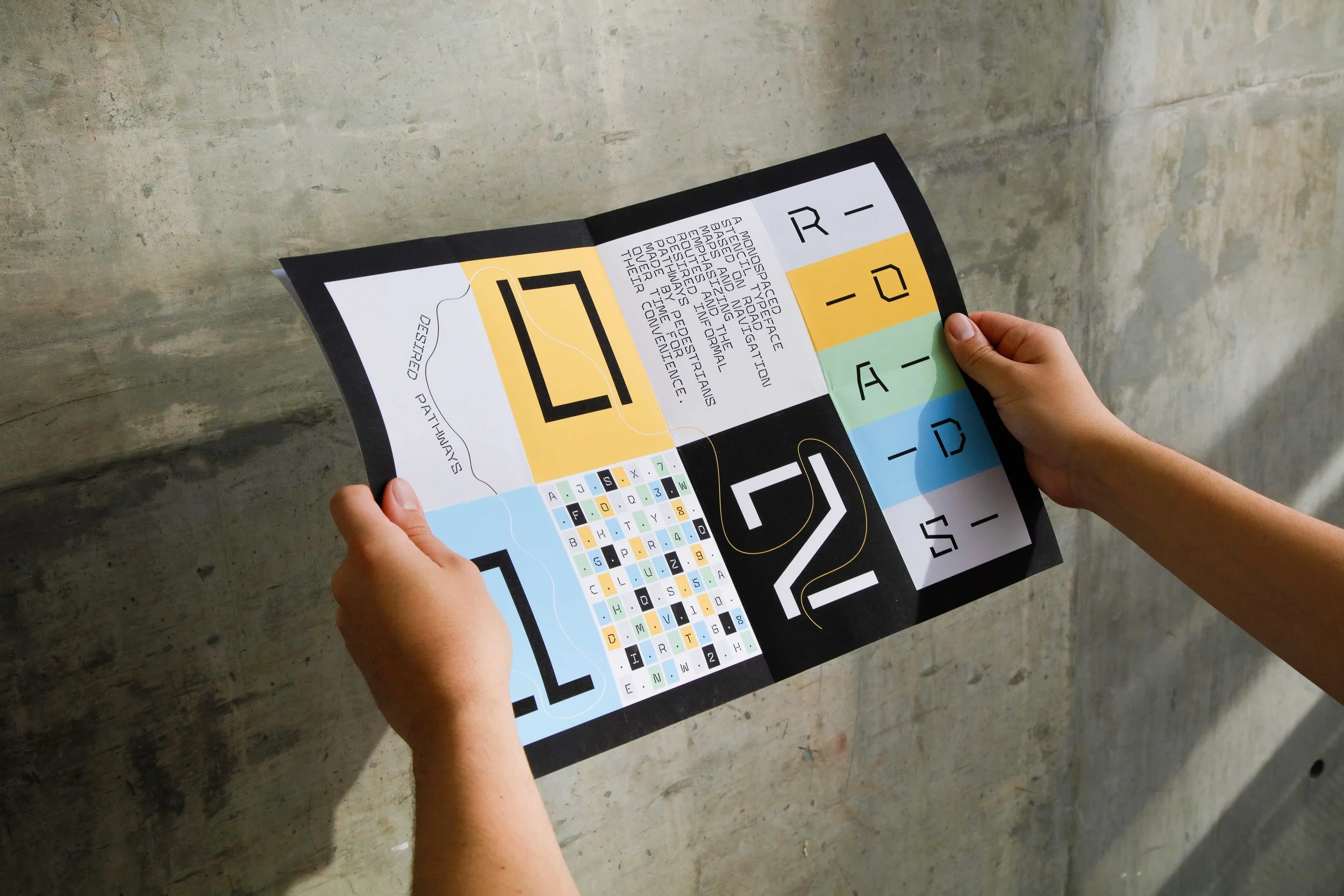
Roads Type Specimen
Folded tabloid poster size: Inspired by the Road maps folded booklet.
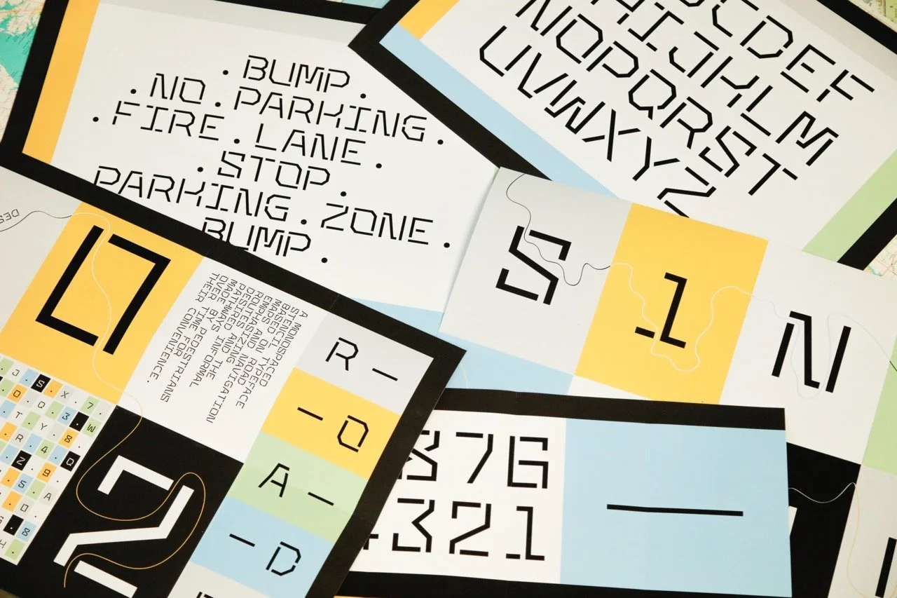
Small stencil sets were made for Roads typeface to make spray-painted type specimens
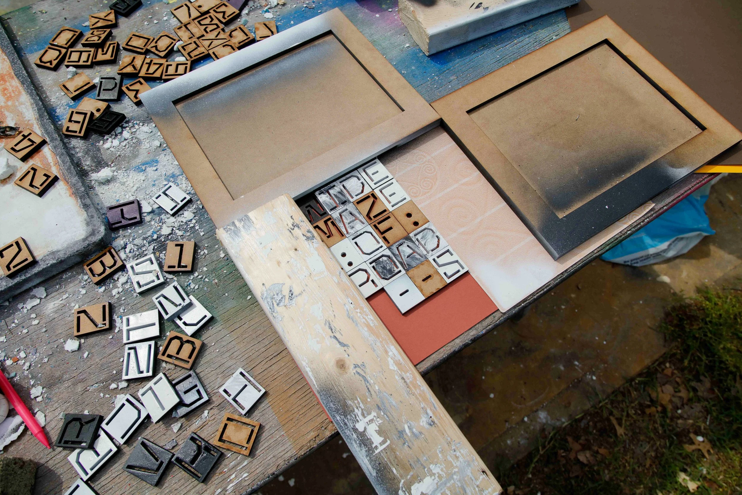
Spray painting process
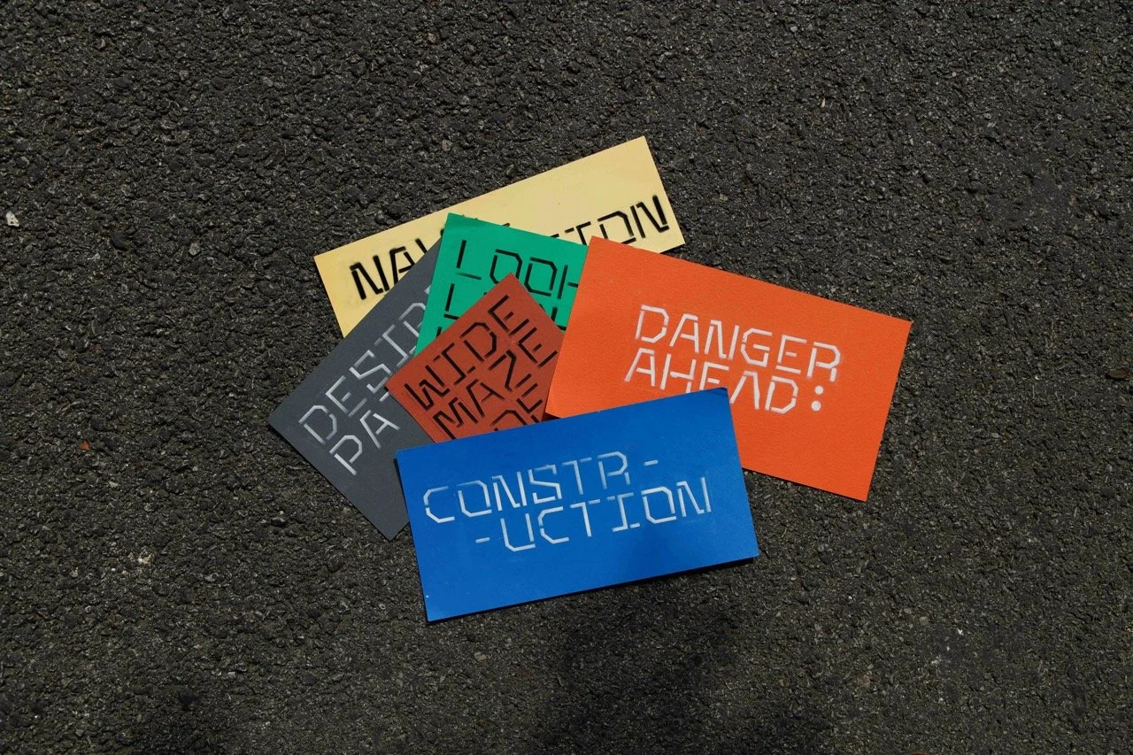
Type Specimen set for Roads
Excerpts of the Flipbook
The flipbook showcases 90 images of the changing textures on the streets, recreating the feeling of walking on the sidewalks of Baltimore city.
The cover of the flipbook
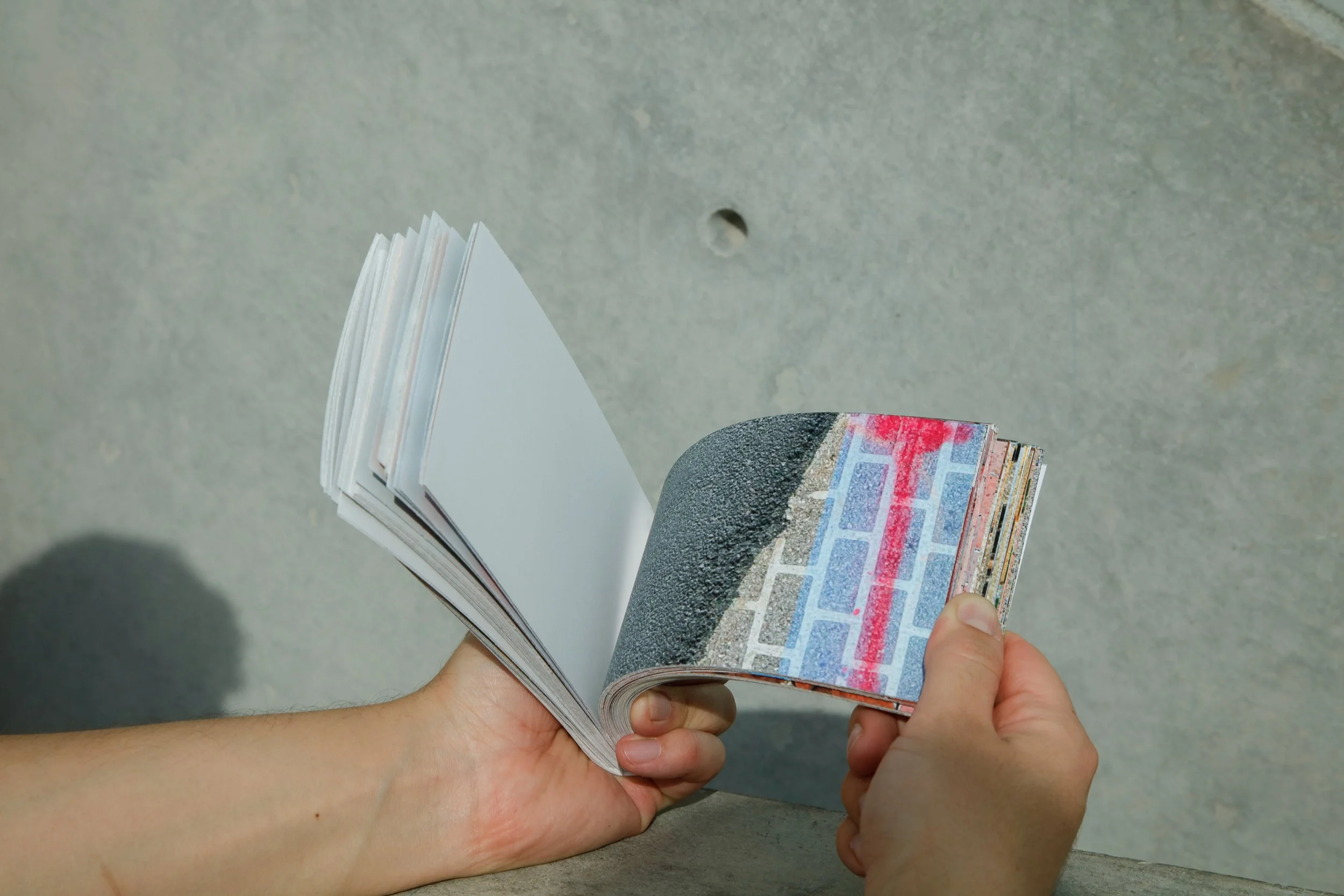
The flipbook in use
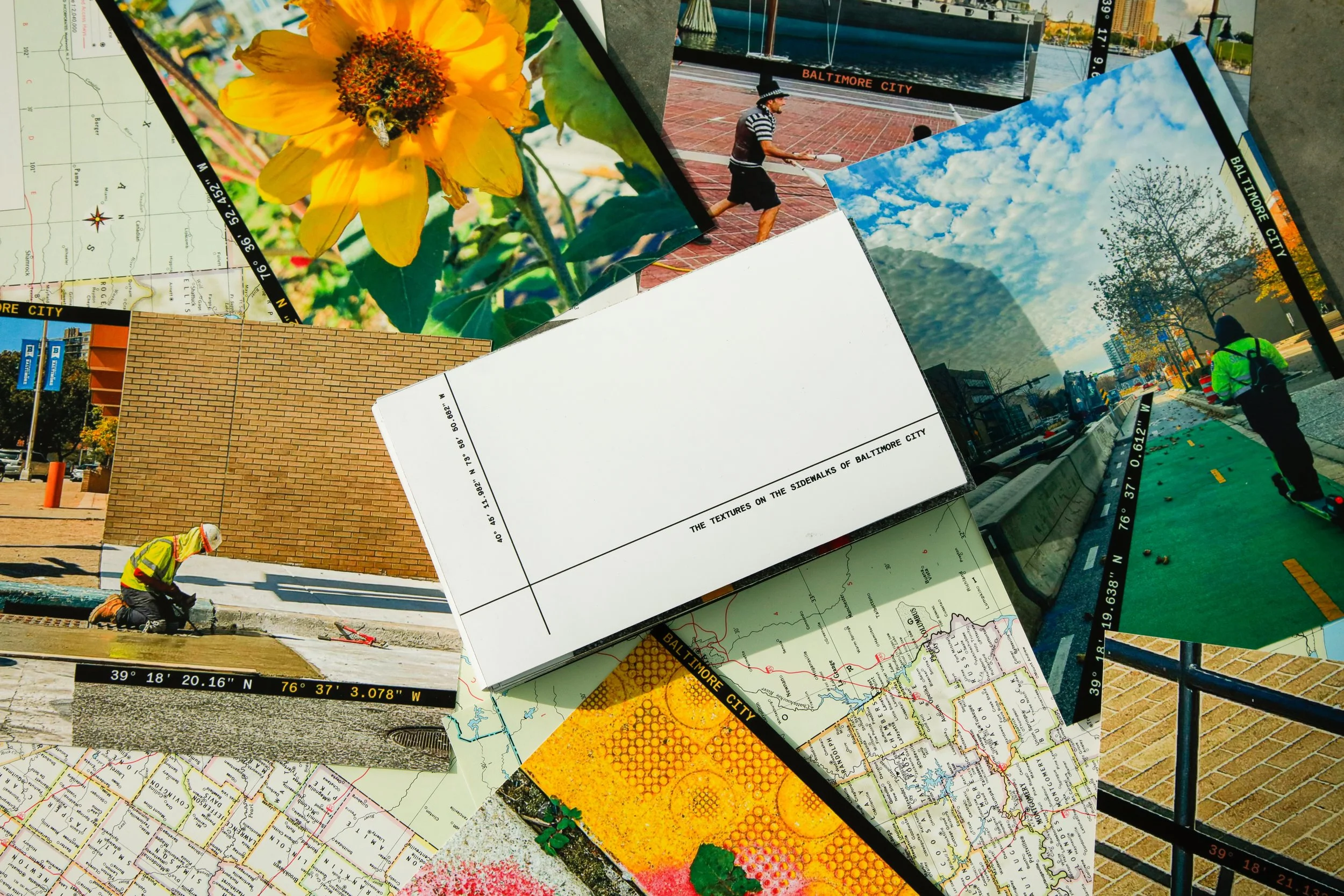
Photographic poster series
A photographic poster series capturing the fleeting moments on the streets with location coordinates.
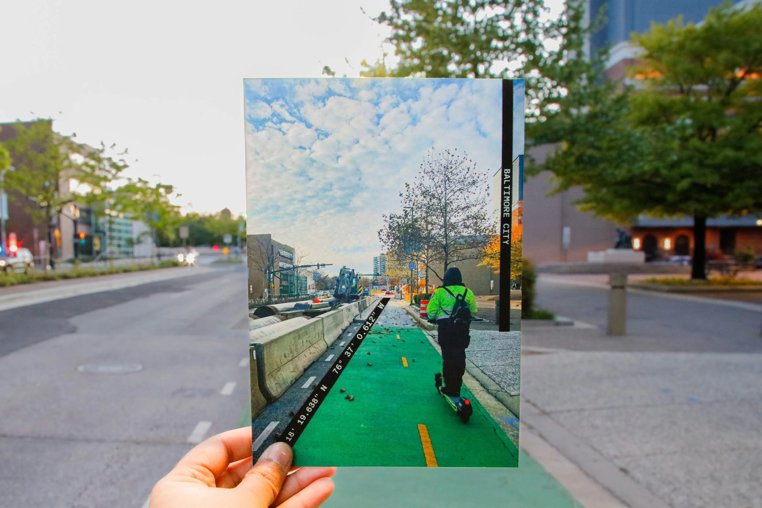
To showcase how fleeting the moments are, the posters are photographed again at the same location.
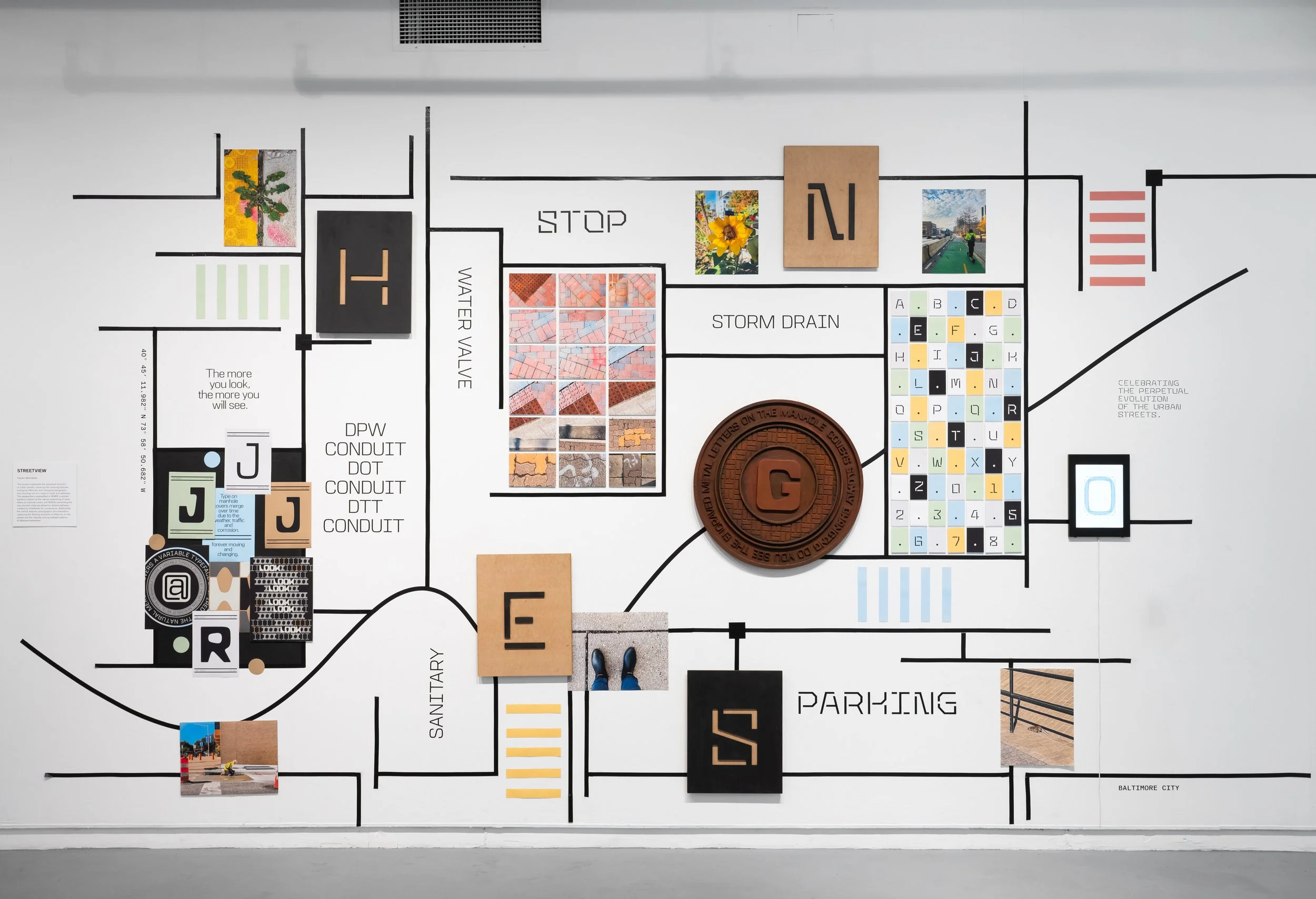
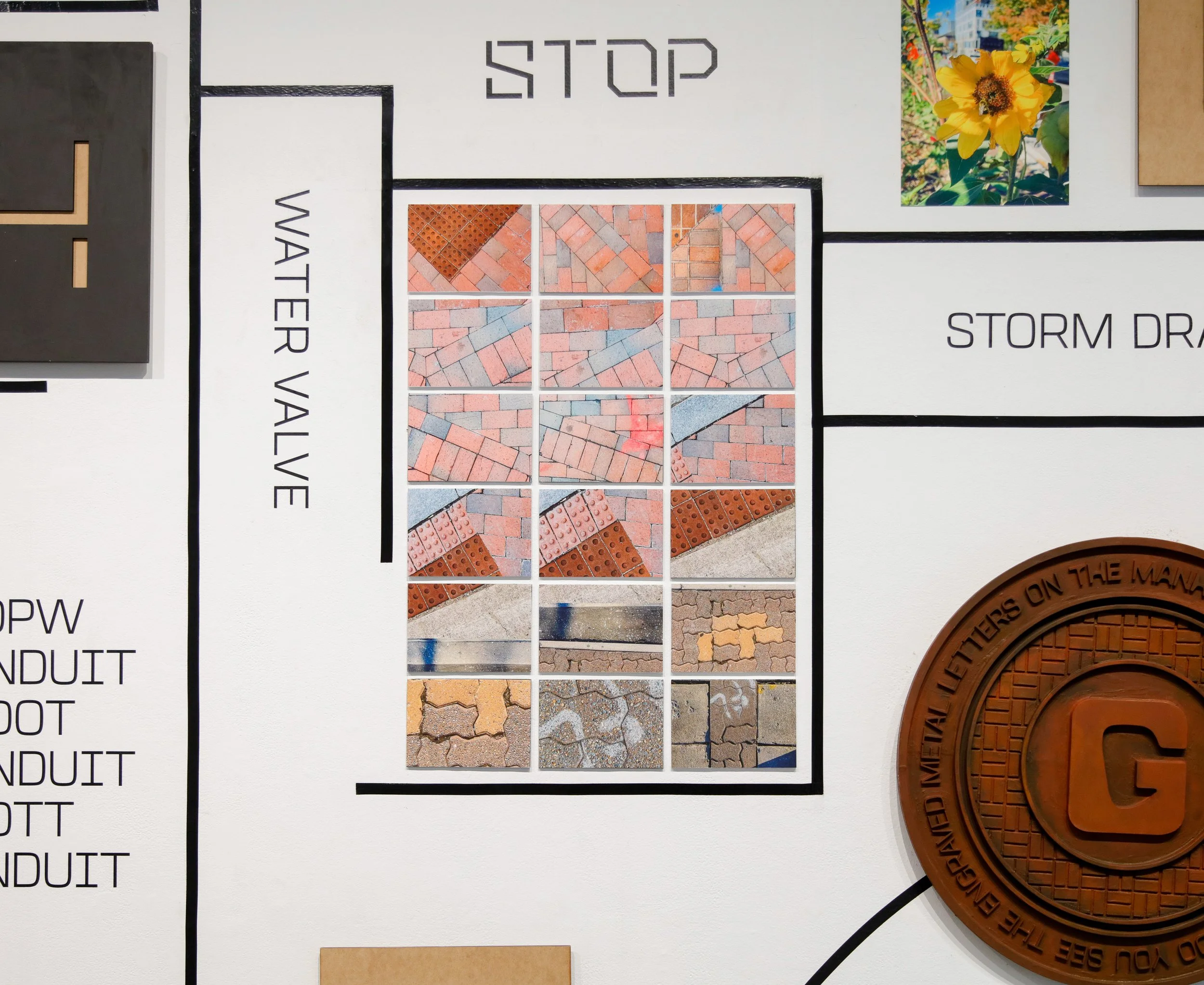
Street View: Exhibit layout
The exhibit layout showcases a gridded map with a convenient path passing through the middle.