
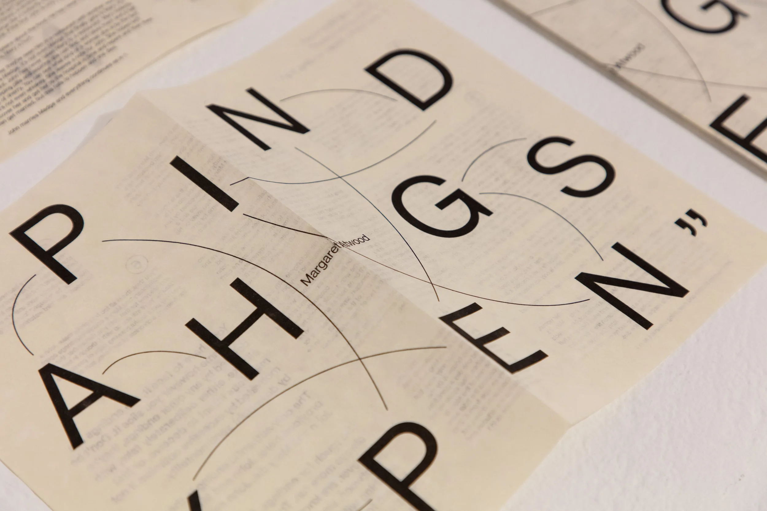
Play is a simple word we encounter every day as children, yet play is often derided as a frivolous waste of time as we grow into adults. This project began with the question, “What would play in graphic design look like?” My thesis is a creative interpretation of Margaret Atwood's provocative, seemingly non-linear story, "Happy Endings." Atwood’s experimental tale has one beginning and one end but six different in-betweens, which I use as my playground.
Happy In-betweens
Anubhooti Gupta
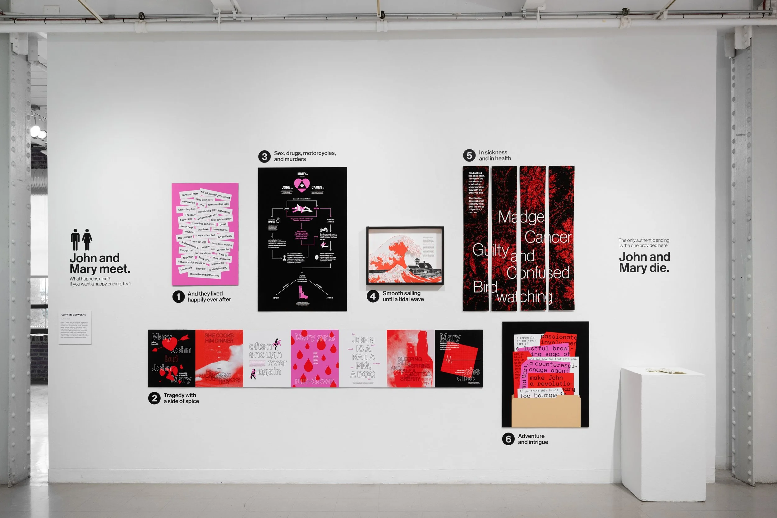
Thesis Exhibit
Photograph by Vivian Marie Doering
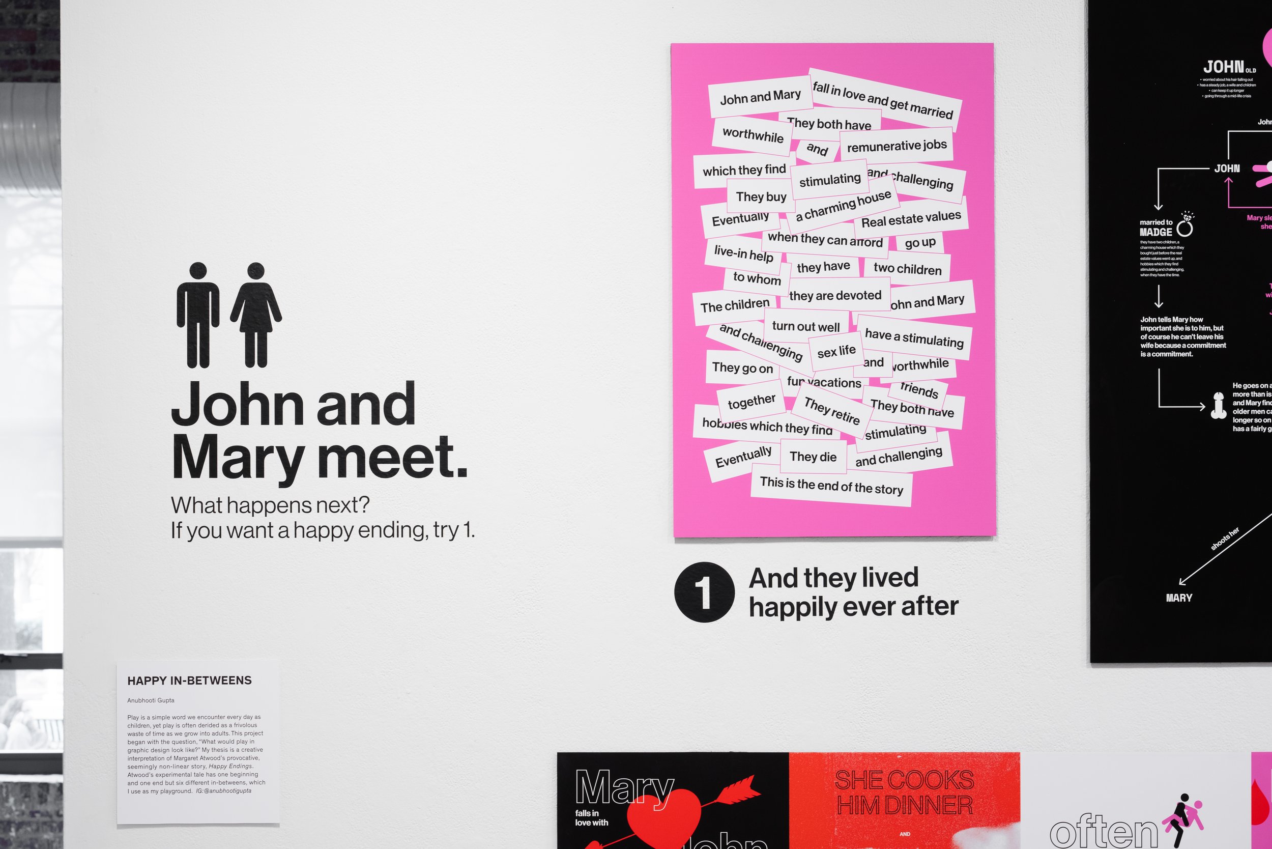
John and Mary meet.
The beginning and option 1.
Photograph by Vivian Marie Doering.
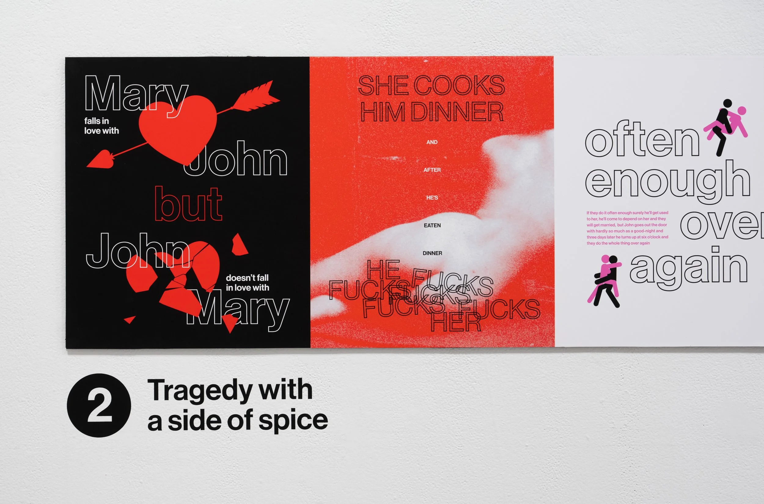
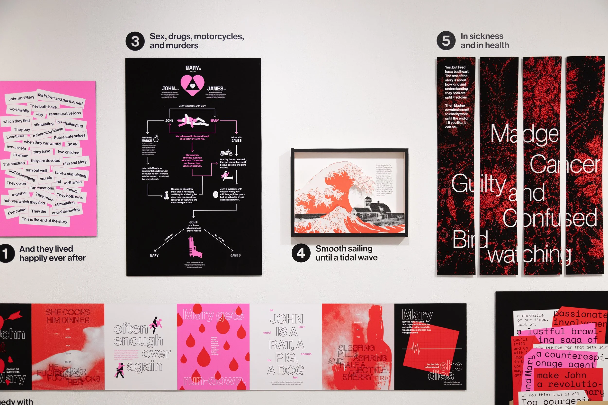
Tragedy with a side of spice
Close up of the long panel for option 2.
Photograph by Vivian Marie Doering.
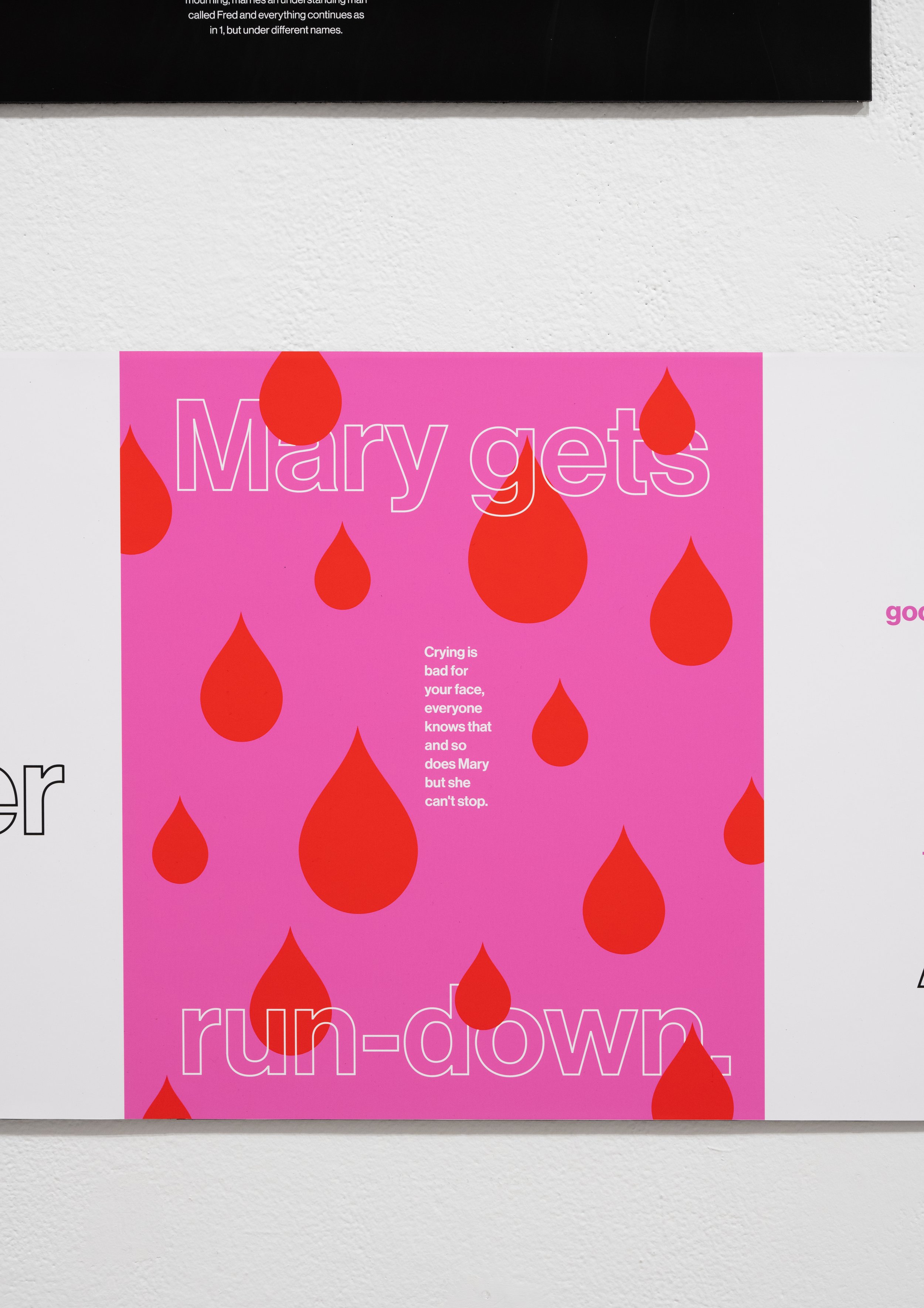
Another close up from option 2.
Photograph by Vivian Marie Doering.
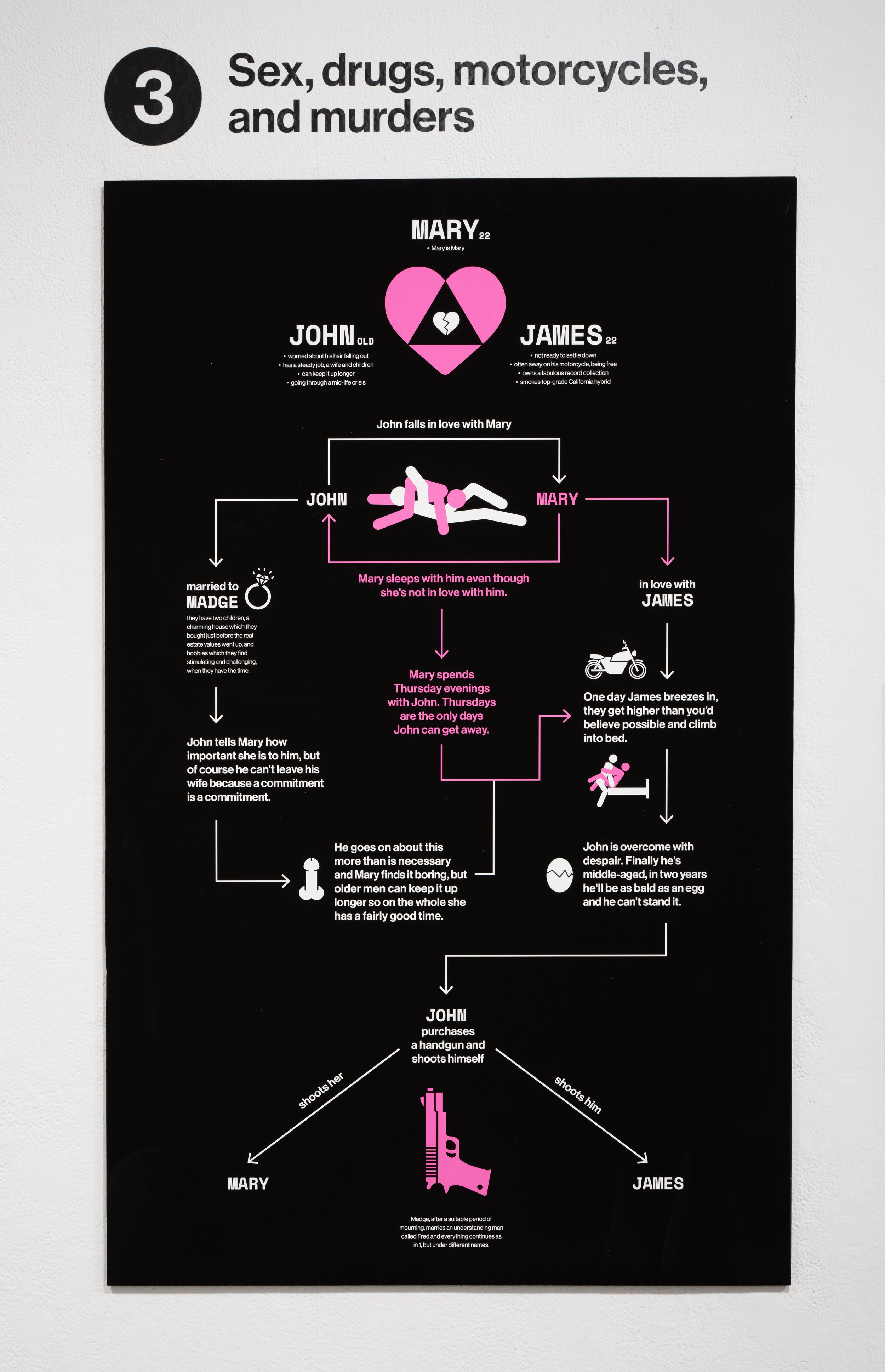
Sex, drugs, motorcycles, and murders
Infographic for option 3
Photograph by Vivian Marie Doering.
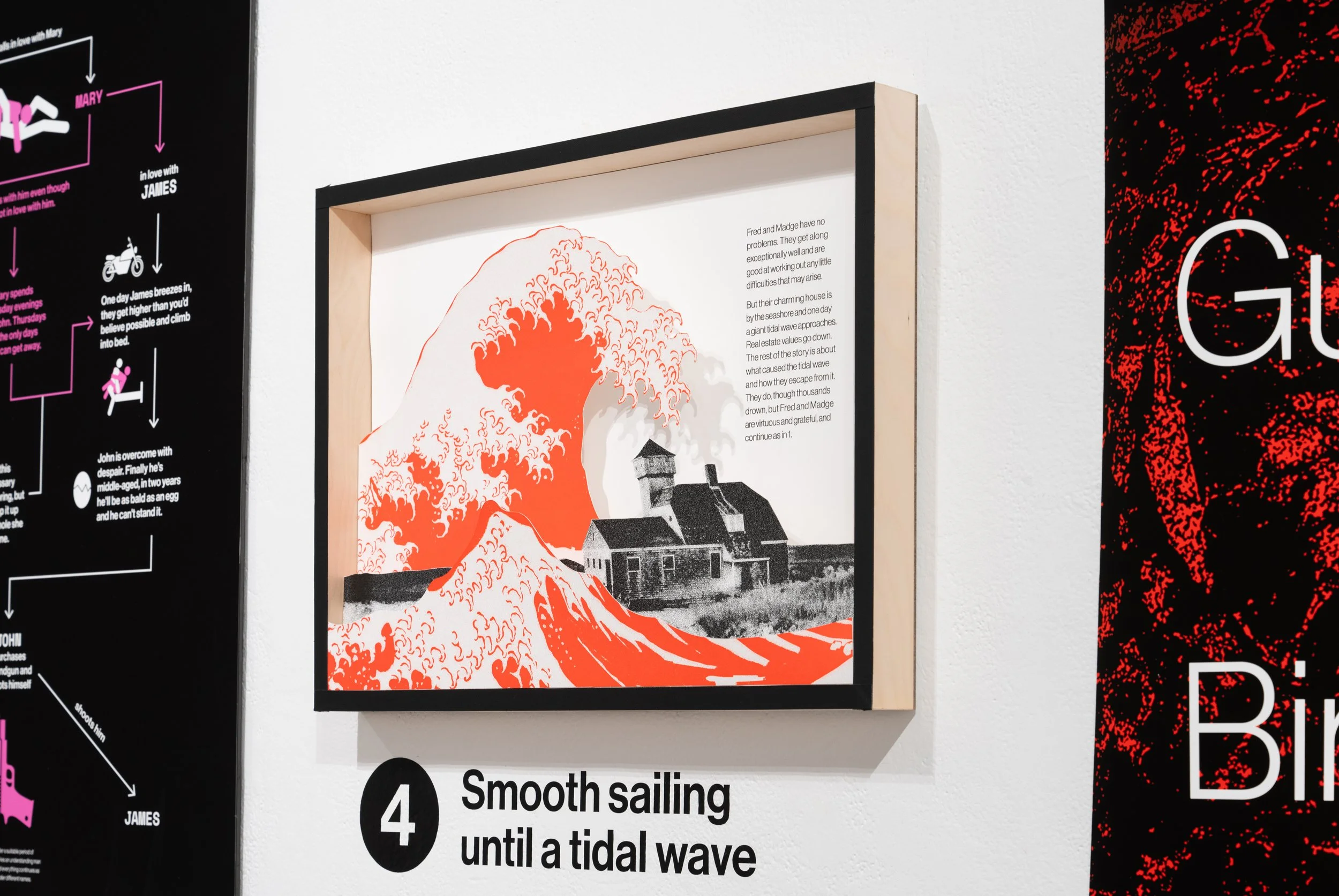
Smooth sailing until a tidal wave
Shadow box for option 4
Photograph by Vivian Marie Doering
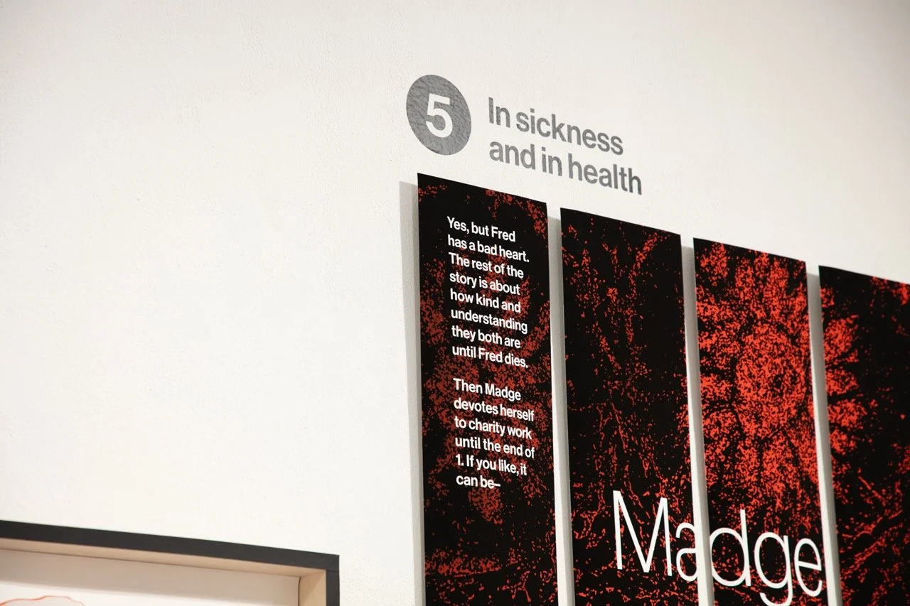
In sickness and in health
Long, narrow panels of type and texture for story option 5.
Photograph by Aumika Shetty.
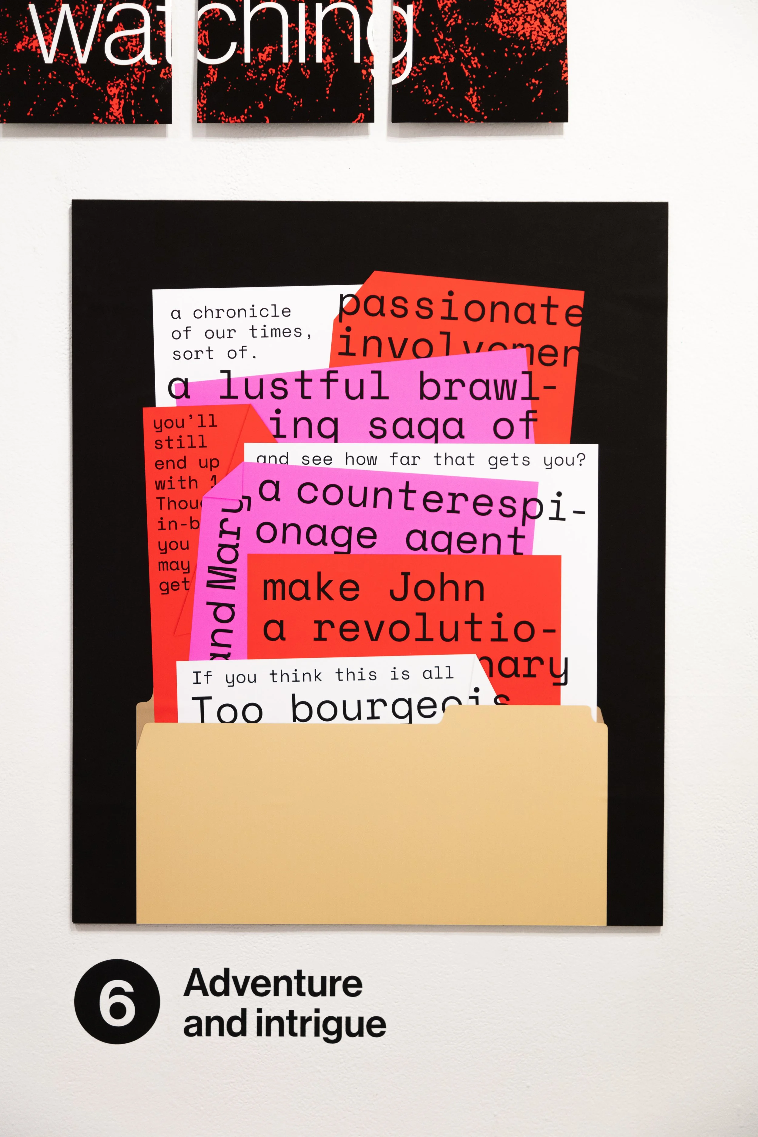
Adventure and Intrigue
Photograph by Aumika Shetty.
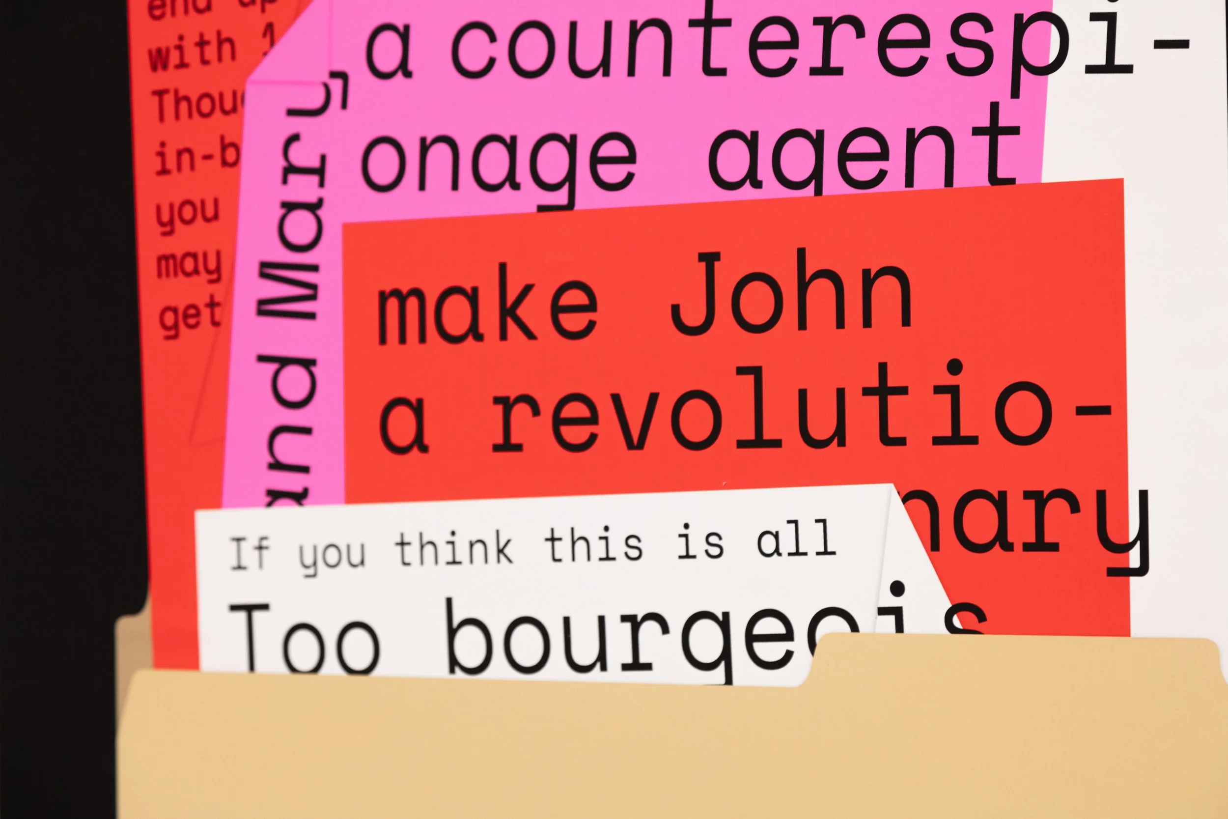
Close-up of option 6.
Photograph by Aumika Shetty.
Thesis Exhibit
Photograph by Aumika Shetty
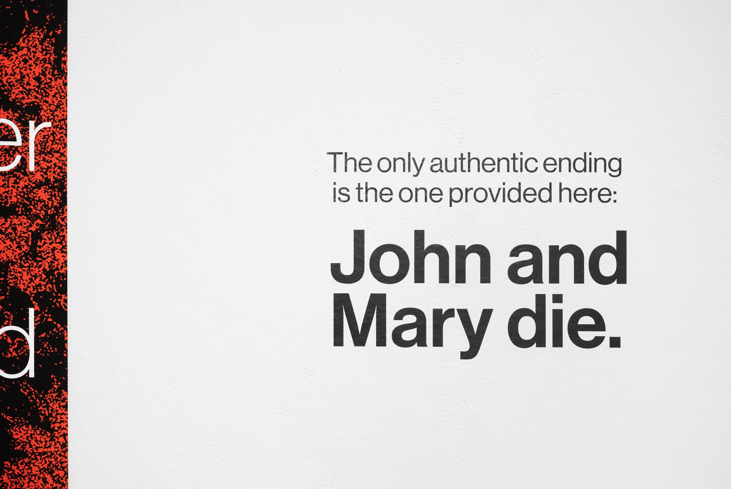
John and Mary die.
The end.
Photograh by Vivian Marie Doering
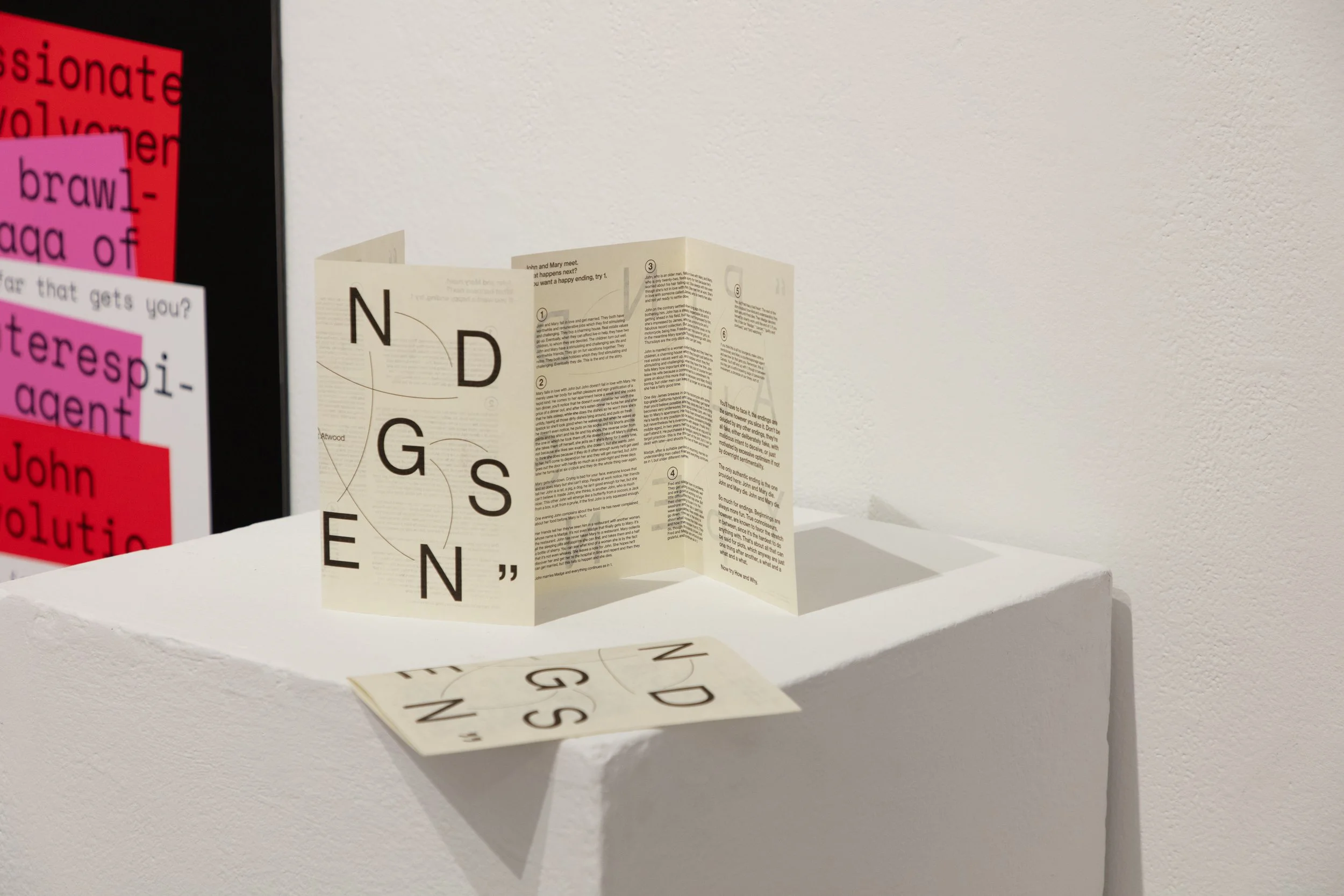
Giveaway zine for the Exhibition
The zine laid out the entire text of the story. Riso-printed on French Paper 65lb Text.
Photograph by Aumika Shetty.
Front and Back cover. Photograph by Aumika Shetty.